|
Working with Bookmarker and Greeting Card Printables: Part 201 |
|
Written by Joli Kirk, Contributing Editor
|
{JCSBOT SUBSCRIPTION=10,13,16,21,22,23}Click HERE for Part 101.
I
ve created two parts to this article a 101 and a 102 series. Do one or both of them and have fun.
I primarily use Paint Shop Pro version 8 when designing and thats what Ill be using while I teach you the techniques for these projects. As long as you have a basic understanding of your preferred graphics program you can certainly use it to achieve the same effects.
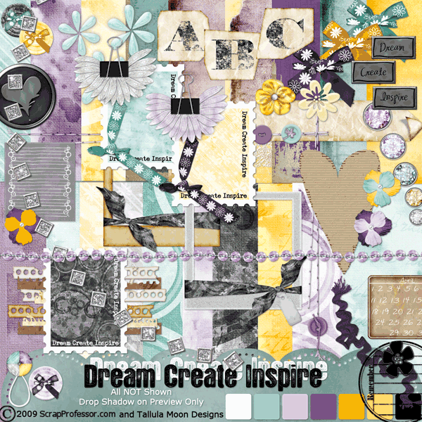
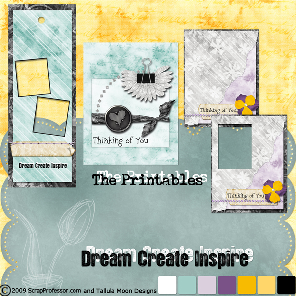
Kelli (Tallula Moon Designs) and I (ScrapProfessor) created a freebie kit for this issue of the magazine. Its called Dream. Create. Inspire. Included with the kit are some printables. Theres a bookmarker printable and some greeting card printables. In part 101 of this article I show you how to use the printables as is and also how to customize them to fit your needs. In part 102 of this article Ill show you how to turn the printables into templates so you can create your own bookmarkers and greeting cards with other kits. How cool is that!
BOOKMARKER PRINTABLES 102:
|
Now were going to step it up a bit and Im going to teach you how to create templates from my printables and use other kits to create your own printables. Its really super easy and lots of fun.
- The first thing you want to do is open up the bookmarker printable that comes with the kit. Again I am using Paint Shop Pro version 8.
- Duplicate the image (SHIFT + D) and close the original.
- Now were going to create a template by turning the bookmarker image black. The quick way is SHIFT + H on your keyboard. This brings up the Hue/Saturation/Lightness control window as shown in Figure 5. The right hand slider should be dragged down until the settings are -100. Or you could input -100 in that box, as shown in Figure 5. Click OK.
|
|
|
|
- Your image will now look like that as in Figure 6. Youll notice that we still have the holes as in the original. We will want to paint them black so we have a workable template to work with.
- Choose the paintbrush tool in your tool palette. Select a hard brush, size it up so youre not painting all day, change the hardness to 100, and use the settings as Ive illustrated in Figure 7. Make sure your foreground and background color is black and paint over the holes in your image. When you are done youll end up with a solid black image. This image will serve as your template.
- At this time you should SAVE AS a jpg, to a location on your computer, possibly inside a new template folder so you can use it for future projects as well.
Next were going to add papers and embellishments and turn our template into our own design using another kit.
For this tutorial Im going to use my kit, Rejuvenate and you can see the kit here:
http://www.scrapprofessor.com/store/product.php?productid=1076&cat=0&page=1
You can use your favorite kit or something youve created yourself. This is a great time to get creative and put your art to work.
- Open a paper preferably 12x12 so its big enough to use with the template. Im going to use paper07 from my Rejuvenate kit. I love the bright and fun colors and this paper is perfect for my project.
- Once your paper is open youre going to want to make your template file the active window.
- When active youll click CTRL + C (for copy) on your keyboard, then activate your paper window by clicking on its title bar.
- At this time youll click CTRL + E which is the keyboard shortcut for paste as new selection. Youll now be able to move your selection over your paper and place it exactly as you want. If you dont like where youve placed it click your undo button until the image goes away, then hit CTRL + E on your keyboard and try again. Youll have marching ants around your design to show where youre going to cut from your paper.
- When youre happy with where youve placed your template youll want to click on your paper layer in the layer palette. This will keep your marching ants around your template but will select your paper. At this point youll hit CTRL + C on your keyboard to copy the selected part of your paper. Hit CTRL + V on your keyboard to paste this paper selection as a new image. See Figure 8 to as an example to these steps.
- Now we need to add some elements to our bookmarker. It would be a good time to save the image so we dont lose our work.
- Once youve saved your image you can add some elements by clicking the browse button to navigate to the elements that would best complement the paper youve chosen as the base for your bookmarker. Im going to use bookplate01 and charm02 from my Rejuvenate kit for this example.
- Open your element images, copy them (CTRL + C), and paste them (CTRL + L) onto your bookmarker. Close the element files after youve pasted them onto your bookmarker so you dont accidentally disrupt your originals.
- Using your move tool (M) move your images around until youve found the spot youd like to see them.
REMEMBER: Once youve got your image saved you should hit CTRL + S on your keyboard often so you dont lose any of the work youve done. Its a good idea to do this every two or three steps. It will become second nature as you work more in Paint Shop Pro and I recommend making it a habit.
- Next you can add drop shadows to your elements as desired for a realistic look when you print them later. To add a drop shadow click the Effects menu, choose 3D Effects, then Drop Shadow. Figure 9 shows the settings Ive used but you can adjust them as youd like.
- At this point we can add a photo or some text to our image. What you add or dont add depends upon what you want your final bookmarker to look like. Ill show you how to add a photo (and make it realistic) and also how to add text to the bookplate image so it looks realistic.
- Lets start by adding a photo box above our charm. Youll want to use your selection tool by clicking the S button on your keyboard. This will make it active so all you have to do it click and drag the box on your paper layer of your image. Click and drag where you would like your photo to be placed. Youll get the marching ants where the selection is. Make sure youre on your paper layer and hit the delete key on your keyboard. This will delete that part of your paper allowing you to insert a photo when youre ready. See Figure 10.
- Youll now have an image that looks like Figure 11 complete with an open space, a photo box, on your image.
- At this point youll want to open the photo you want to use on your bookmarker. Ive opened an image of my daughter and my grandson. Ive turned the photo image into a grayscale image by choosing Image Greyscale. Its important to turn the photo to a greyscale image BEFORE you paste it as a new layer into your bookmaker. If you do it afterwards youre entire bookmarker image will turn to greyscale and thats just blah.
- Once youve turned your photo to greyscale (if this is what you want to do), use your keyboard to copy and paste it as a new layer. We do this with the keyboard using CTRL + C which copies your photo.
- Now activate the bookmarker image, and choose CTRL + L to paste your photo as a new layer on your bookmarker image.
- At this point youll want to drag your photo image BELOW your paper layer in your layers palette. This will put your photo below the paper layer and we can then apply the proper drop shadows (if desired) to our paper layer as you did earlier. Its always a good idea to use the same drop shadow settings for any and all layers EXCEPT when youre applying a drop shadow to something that is obviously TALLER or HIGHER than the other layers/images in your project. Remember, realism is the key.
- Figure 12 shows you my bookmarker, with my photo, and the drop shadow applied. Yours might look different depending upon the settings you choose.
- Next Im going to add a white area behind my bookplate so I can type on it and have it realistic looking as well. I will do this by choosing my Preset Shape Tool in the tool palette as in Figure 13.
- Youll want to select your paper layer, choose a square shape for your preset shape, and make the color white (or whatever color compliments the colors of your bookmarker), and draw it fitting below the image layer where you want it placed as shown in Figure 14.
- Now weve got something to type on. Choosing your type tool (the A in your tools palette) youll want to choose a font that goes well with your bookmarker project. Ive gone with LD Remington Portable. I will type above my white layer and choose the date my grandson was born for the type as shown in Figure 15. Ive also added some staples to the holes in the bookplate. Use your arsenal of supplies to acquire the same effect such as eyelets or brads. HOWEVER, you could easily add these traditional items to your printed project to really give it that super cool 3-D effect which is what hybrid scrappers really go for!
- Once youve got the base done for your bookmarker, youll want to add the hole where your ribbon or fiber will go once youve printed your project. Well do this by selecting our eraser tool in the tool palette, and selecting a size that fits our bookmaker. See my settings in Figure 16. Change your settings to fit your bookmarker.
- This is a good point to save your bookmarker if you havent already done so.
- If youre happy with all the elements, type, and drop shadows on your bookmarker, you should save your final file and print it onto acid free cardstock.
- At that time you could laminate it and distribute to your friends and family, or use it purely for personal purposes.
Is this cool or what! Ive taught you how to turn any design into a template and customize it to your own needs. I think this is an invaluable resource!
GREETING CARD PRINTABLES 102:
You should use the same concepts and principles for greeting card templates as Ive taught you in the previous lesson, Bookmarker Printables 102:
I am here to help you along the way. Dont forget to contact me (contact details at the end of this article) if you need help in any degree. I succeed when you succeed.
THANK YOU! ;)
KEYBOARD SHORTCUTS LEARNED IN THIS ARTICLE:
For any articles I write for Scrapbook Dimensions Magazine, you will see a keyboard shortcut guide at the end which indicates all the keyboard shortcuts Ive used throughout the lesson(s). You could easily write them down and start a master list to refer to when youre working on your own later. I am a firm believer in keyboard shortcuts and I use them all the time in Paint Shop Pro.
SHIFT + D = Duplicate Image
CTRL + C = Copy Image
CTRL + L = Paste Image as a New Layer
CTRL + S = Save
SHIFT + H = Hue/Saturation/Lightness
CTRL + E = Paste as New Selection
CTRL + V = Paste as New Image
M = Move Tool
S = Square Selection Tool
CREDITS:
All the printables this month were created using the Dream. Create. Inspire. Kit created by ScrapProfessor and Tallula Moon Designs who both design at ScrapProfessor.com.
The kit is FREE with this issue of Scrapbook Dimensions Magazine so be sure you download the kit.
QUESTIONS?
Is there something youre confused about? Something youre not clear on? I am happy to help answer your questions. Simply send an email to me, Joli at the following email address:
This e-mail address is being protected from spam bots, you need JavaScript enabled to view it
I respond to all emails as quickly as humanly possible.
|
Joli Kirk, Contributing Editor |
| About the author: |
| My name is Joli Kirk and I design under the name ScrapProfessor. I wrote and self-published a book on scrapbooking in early 2001. I am the founding owner of ScrapProfessor.com and co-owner of YourDigitalDesigners.com and DigiScrapU.com, which is coming soon. Completely self-taught in all my computer/web design skills and in my graphic programs, I am 100% hybrid at heart and look forward to being a part of Scrapbook Dimensions Magazine. |
| Read More >> |
» Comment here!
» Post Comment
Only registered users can write a comment.
Please login or register.
|